Brunswick Residence
Atwater Village, Los Angeles, CA
Residential / Interior Renovation
1,163 SF
Private
Completed
location:
program:
area:
client:
status:
How can you transform a modestly sized residence into a bigger and more distinctive home without adding additional building area?
This was the challenge posed by the clients about their quaint, but overly compartmentalized and decidedly unremarkable 1940’s house. Their desire to maintain the backyard (for lush garden space and an ADU), paired with the reality of tight budgetary constraints, necessitated that the scope of work be focused within the existing 1,160 sf footprint. The clients requested an additional bathroom, a larger kitchen, plentiful storage, and seamless flow between spaces. Architectural sleight of hand was deployed to conjure up more space within the available envelope.
Large doors fold away for a seamless transition between the dining room and backyard.
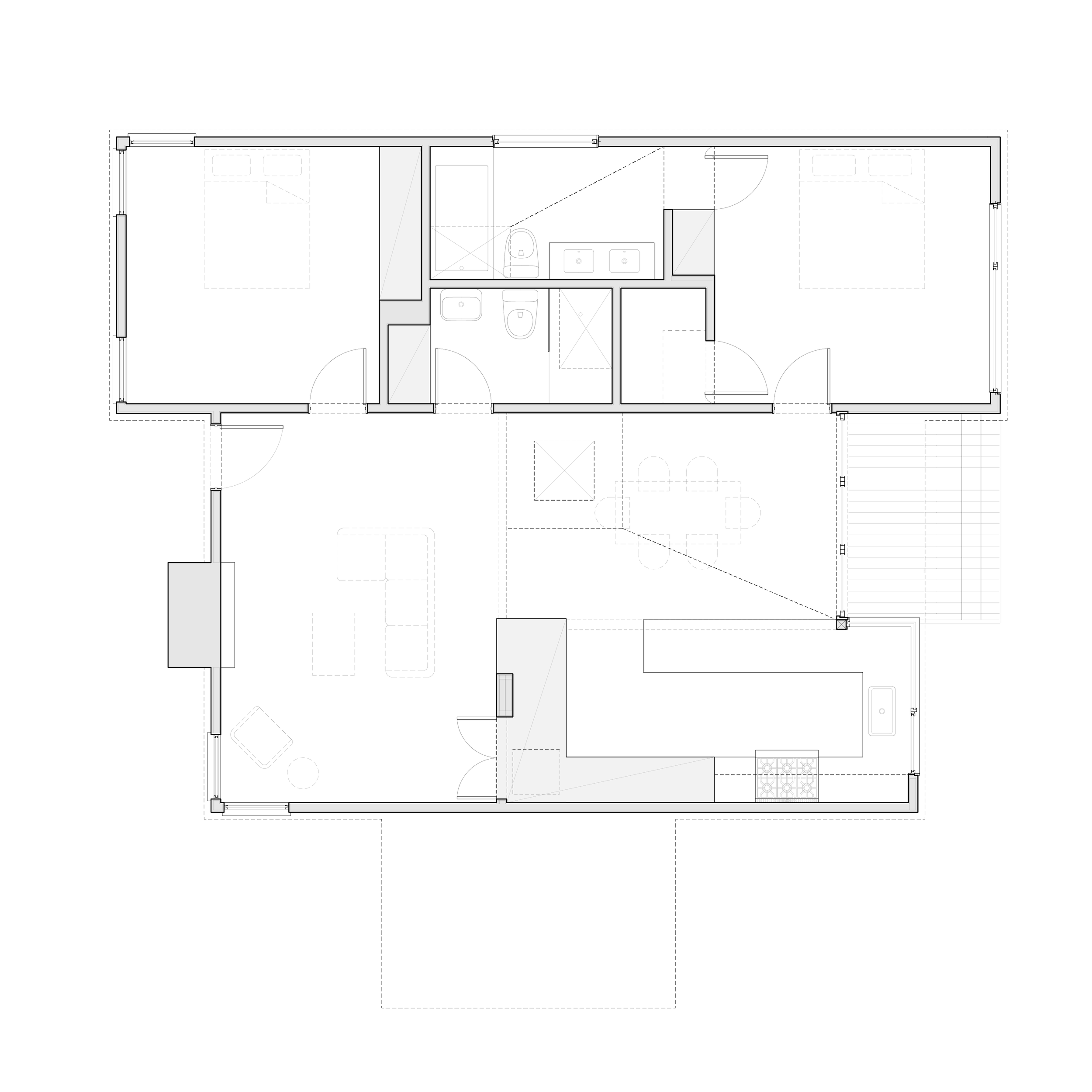
To meet the clients needs, the inefficiencies of the plan had to be addressed. The walls separating the kitchen, dining and living spaces disappeared, allowing the kitchen to become open and generous.
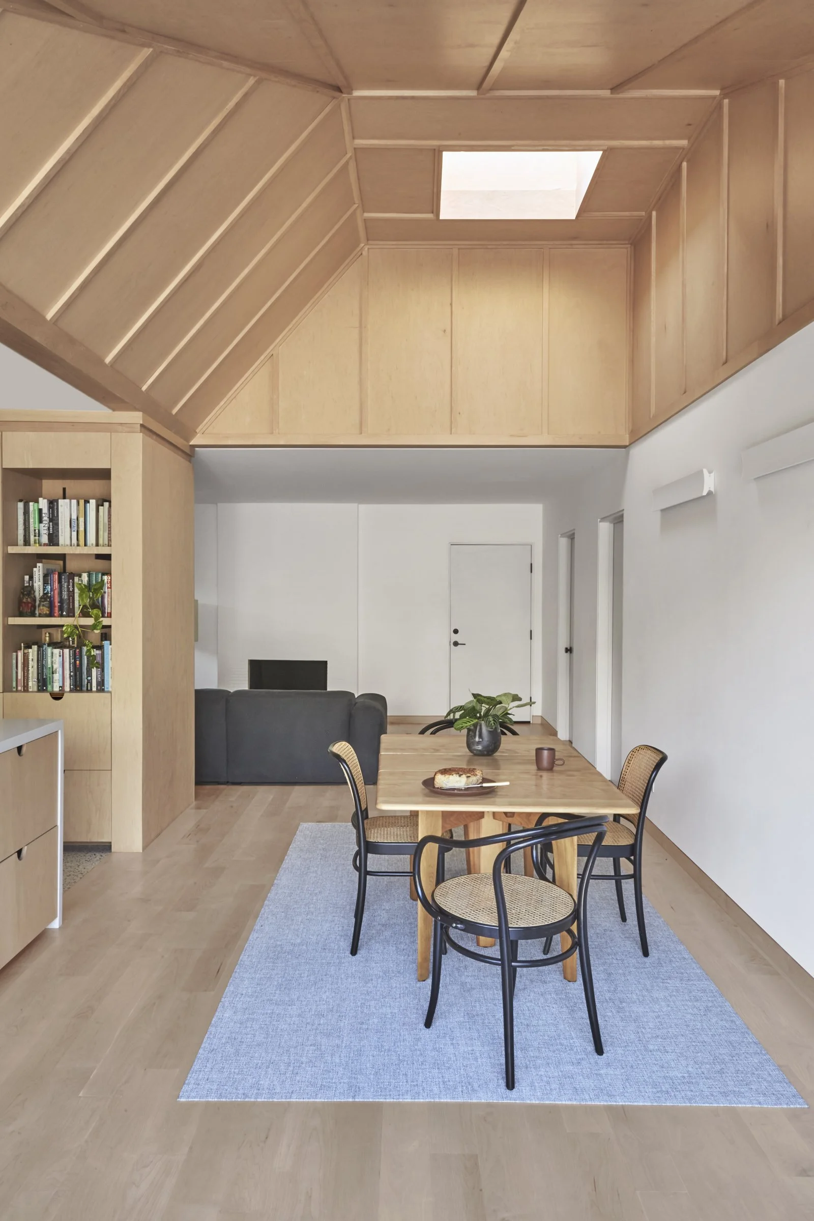
A high vaulted ceiling defines the central dining space.
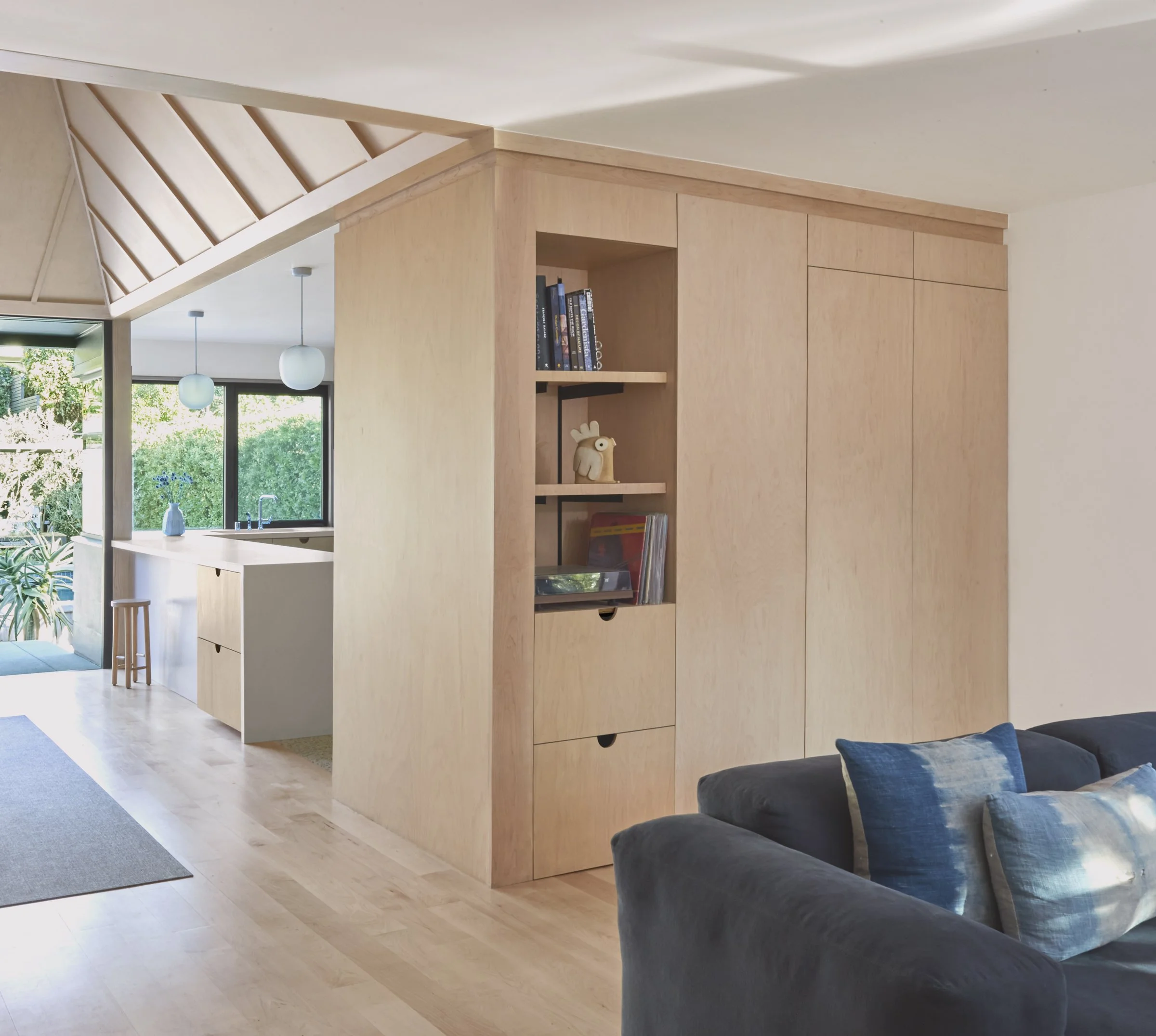
The maple plywood cabinetry and vaulted ceilings provide natural warmth to the material palette throughout the house.
A dual-sided cabinetry volume between the kitchen and living room provides necessary separation, but functions more like an object within one open space, as opposed to a stark division.
The cabinetry volumes houses storage and the laundry unit.
The natural tones of wood, sandstone and warm-gray tile in the primary bathroom evoke a sense of calm and tranquility.
Beyond literal space planning, the design utilizes experiential space planning to peel back the curtain and reveal the architectural qualities of unutilized attic space. Two new vaults (over the dining room and the primary bathroom) vanquish the monotony of the 8-foot ceilings throughout the original house and increase the perceived sizes of the rooms. The drama, light, and airiness provided by the wood-clad vaults creates the illusory experience of a much more expansive and dynamic interior.
In the primary bedroom, the entrances to a walk-in closet and the primary bathroom are integrated within a wall of cabinetry.
The colorful tile in the guest bathroom is a whimsical counterpart to the primary bathroom.
The roof line was simplified along the rear of the house, and larger windows and doors open the interior spaces to the private garden.
Further, special attention was paid to the relationship of the house to the rear yard. A large corner window in the kitchen and floor-to-ceiling doors in the dining room are separated by a single wood post and together they break open the rear facade. By obscuring the distinction between interior and exterior, the new design celebrates the rear yard amenities.
Existing and Proposed Plans
Sections
Enlarged Sections of the Vaulted Ceiling
Photos from before and after the renovation.


